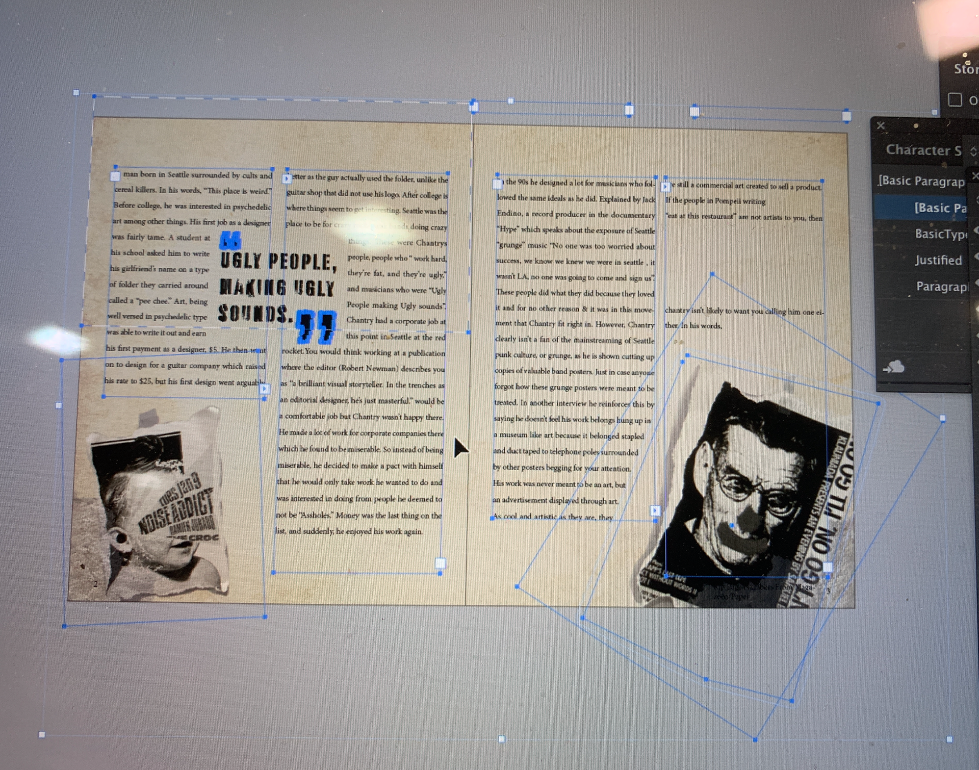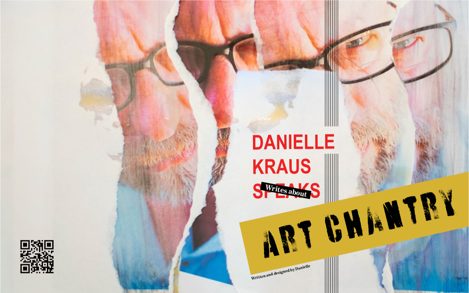
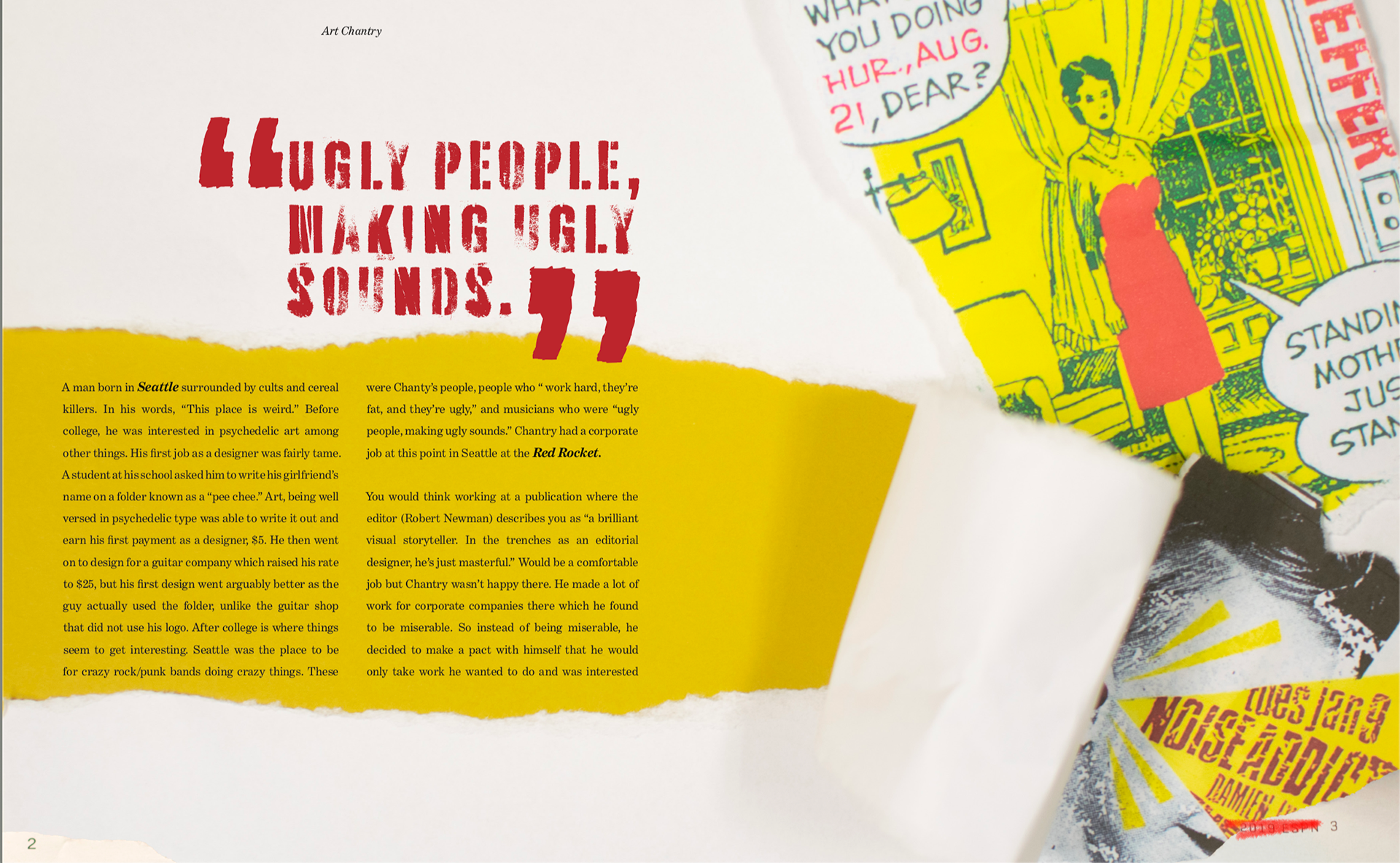
The coffee on the cover is a reference to his video in which he puts a coffee on his own book. The pages are an off white color because chantry is seen smoking in his office regularly, basically I wanted this book to look like he could have had it in his workspace.
This book is printed on Matt paper which adds to its texture of being ripped printer paper.
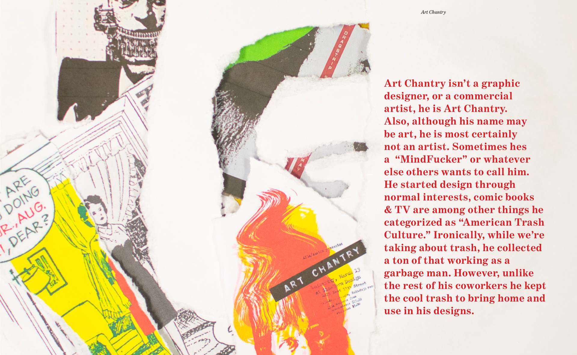
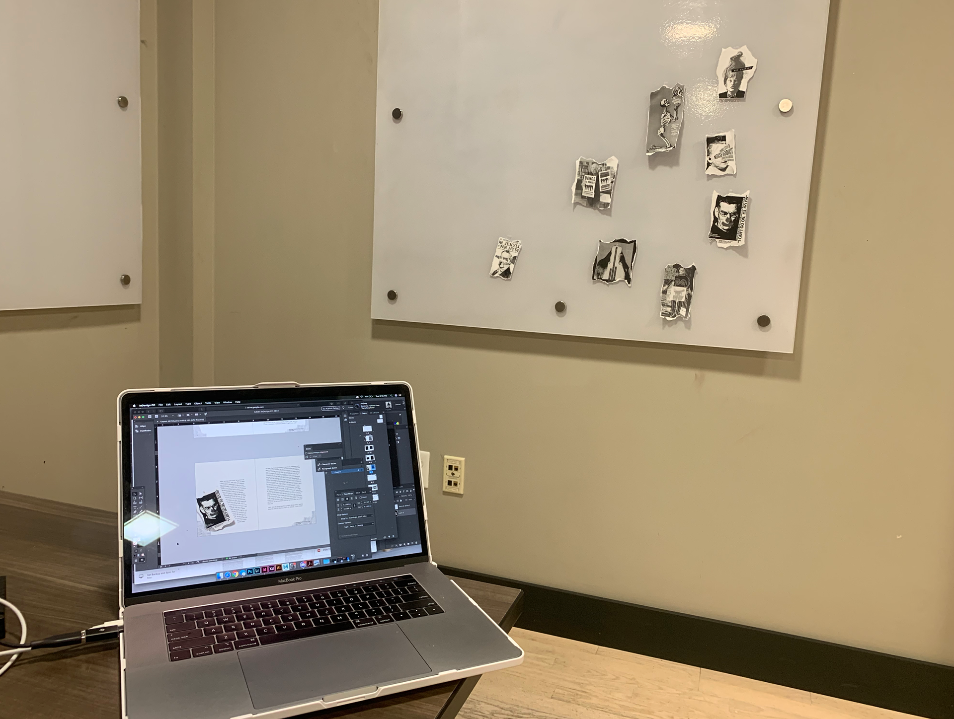
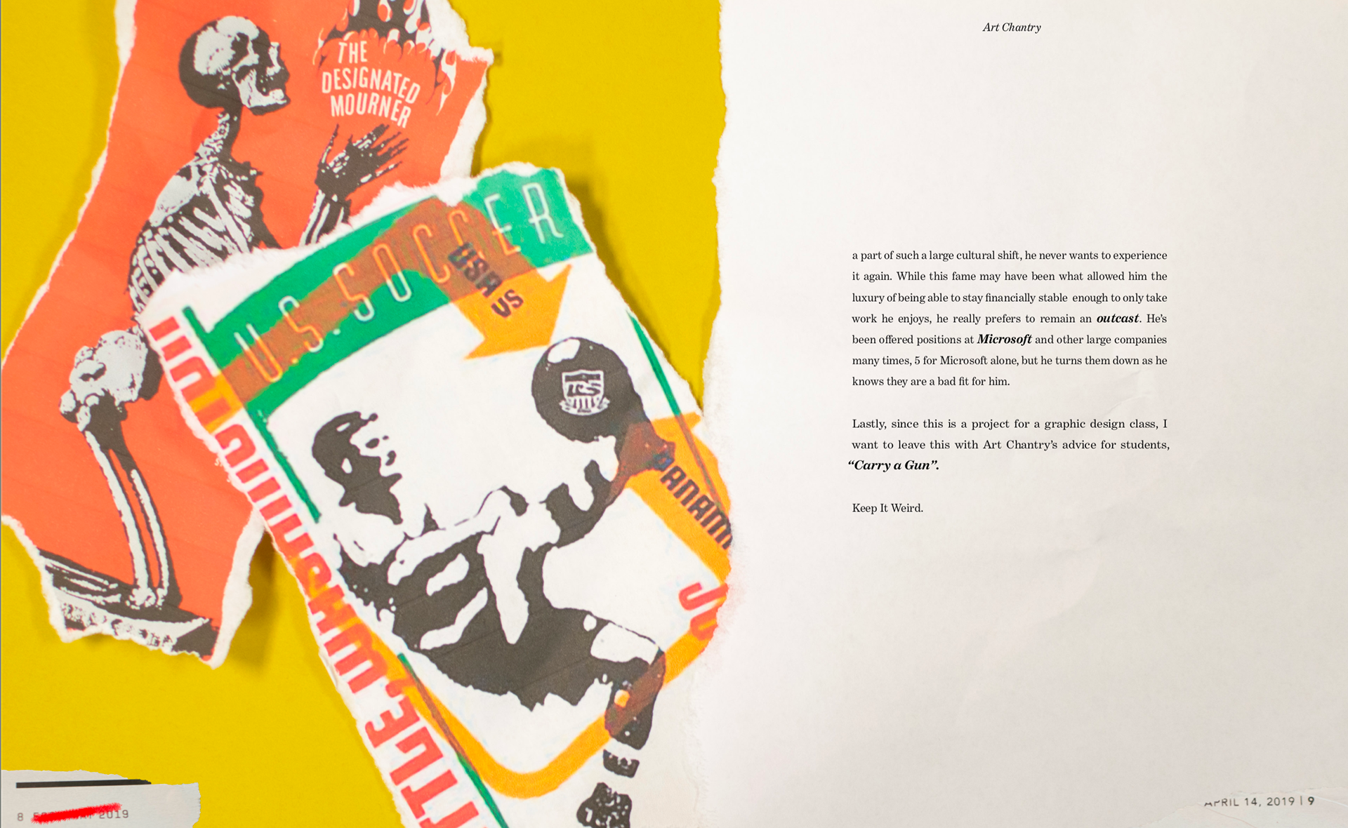
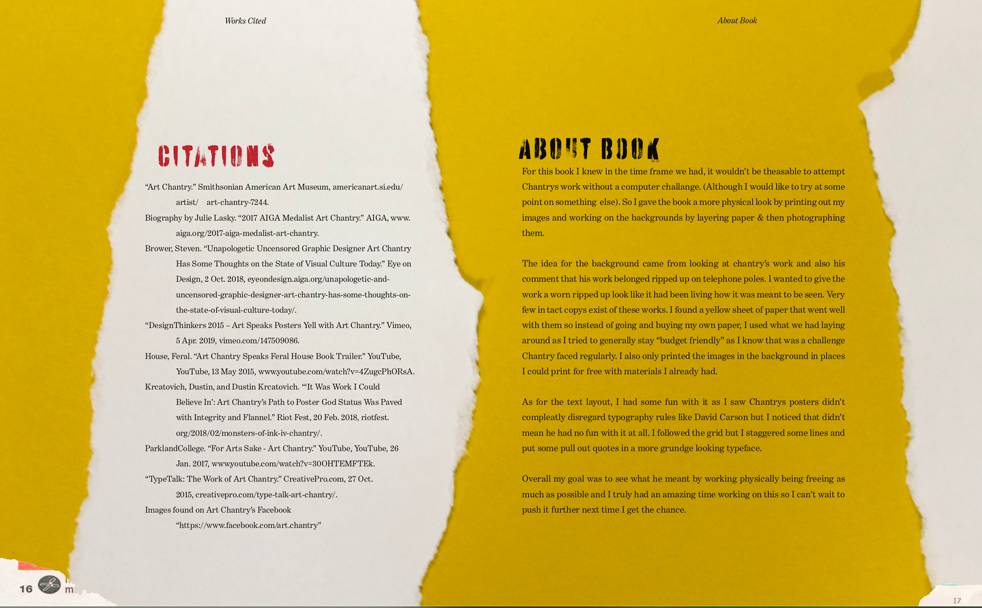
The images seen are mostly pulled from art chantrys facebook page. I wanted the most direct source possible. I then printed them in only places I could print for free. The only thing I paid for with this book was the required final print for class. I know Chantry was often hit with a tough budget and I wanted to fit that as well as possible.
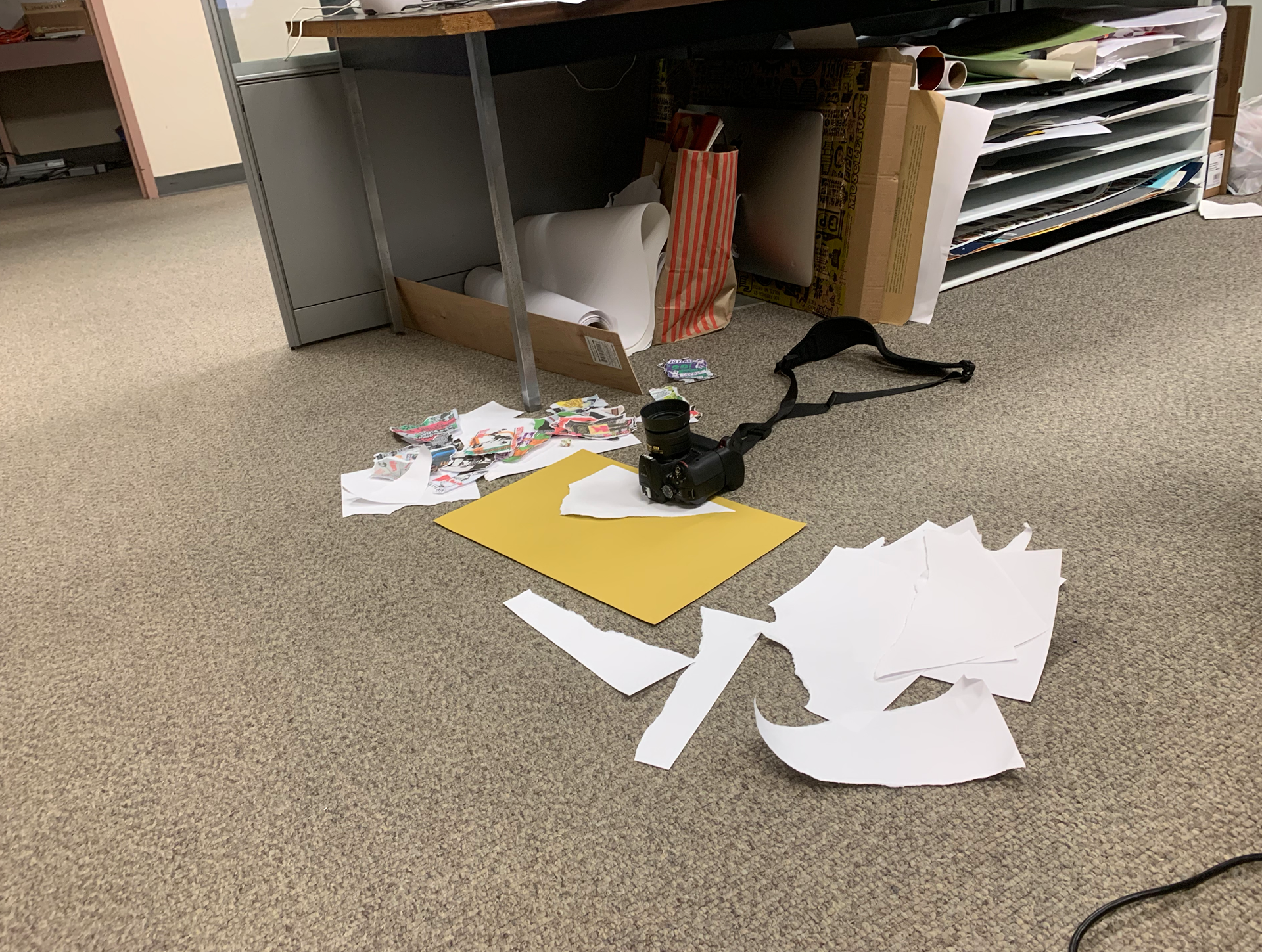
The yellow paper in the background was a paper I found in the classroom that looked long discarded. I felt it looked really nice with my images so I borrowed it for a few hours to place ripped printer paper and images over to create the backgrounds.
The page numbers are old ripped up magazines and ads from the newspaper to add to art chantrys use of recycled images in his work.
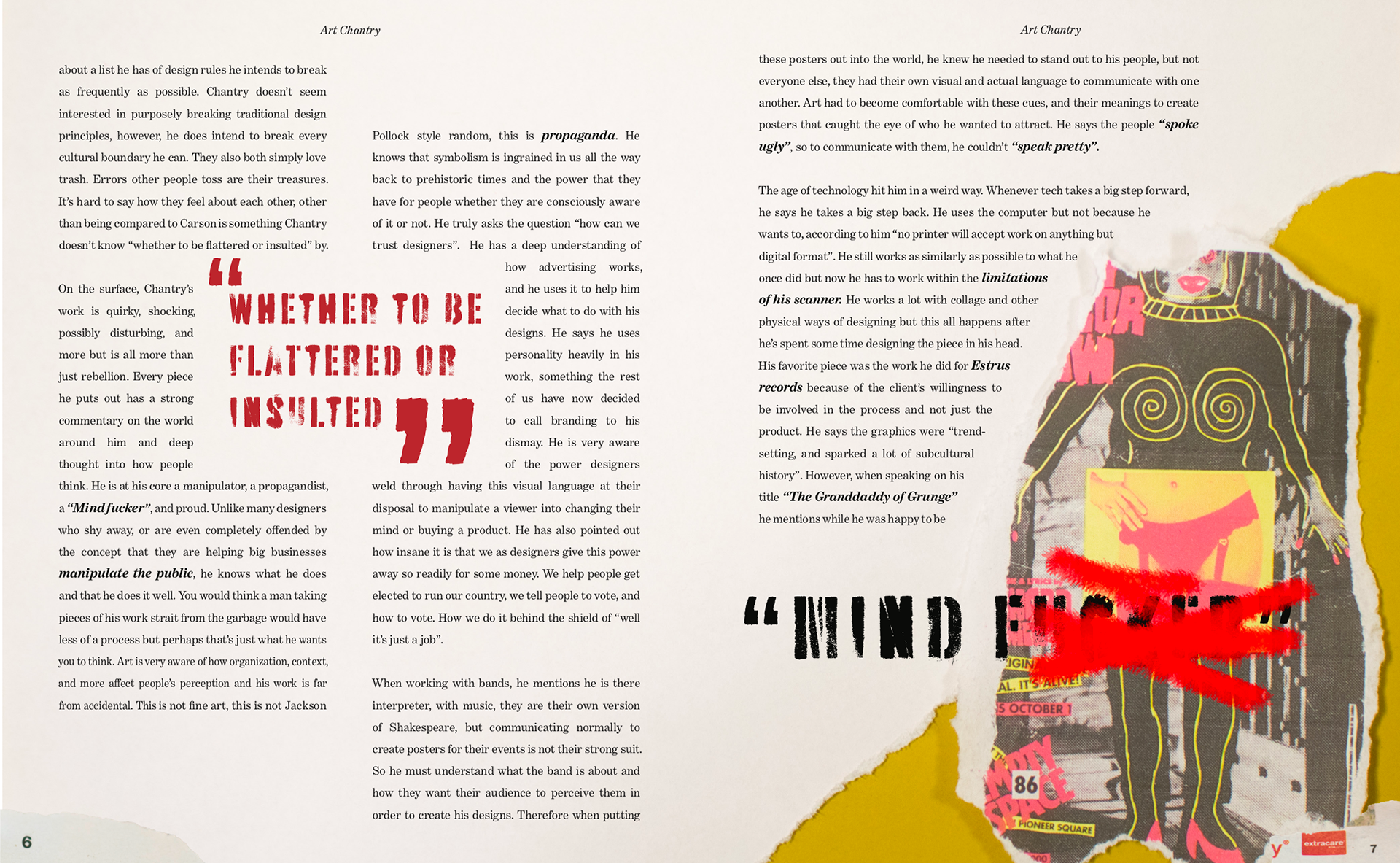
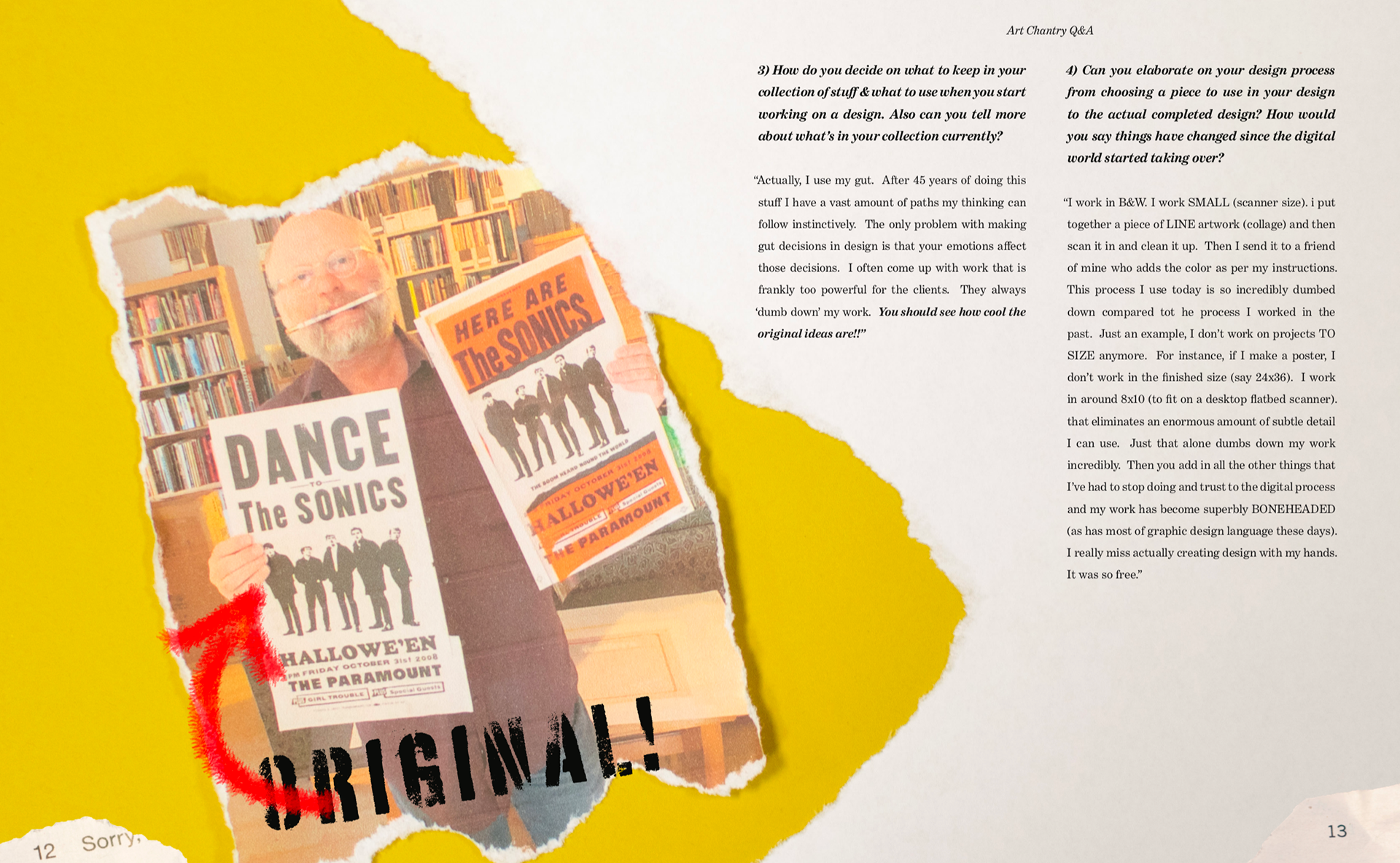
I semi censored this page because in my research of chantry and his Q&A (keep scrolling) I felt like he was censored in a way as the designs never went out how he intended them.
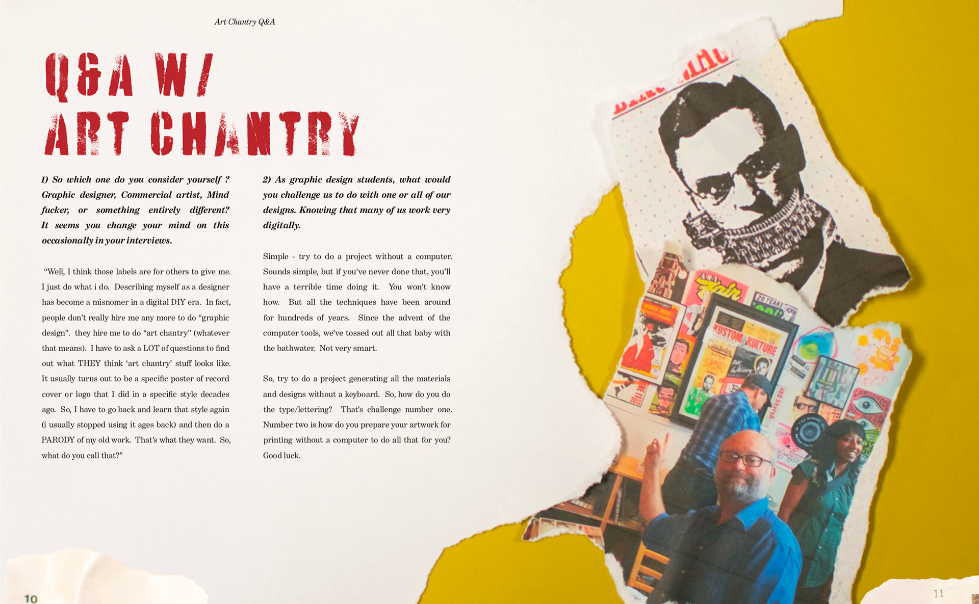
This is a Q&A
I emailed chantry and I got lucky he responded within a few hours, Supper cool guy.
In Progress, I started with a more exaggerated aged look, while this wasn't awful, it was too flat & needed more contrast.